Цвет: гармония, трение, температура
Цвет — это не просто украшение на холсте. Это живая сила, которая направляет наш взгляд и меняет настроение. Мы часто думаем, что сочетание цветов — лишь вопрос вкуса, но существуют четкие правила, объясняющие, почему одни комбинации нас расслабляют, а другие — будоражат. В этой статье вы узнаете, как использовать гармонию, трение и температуру, чтобы понимать живопись как профессионал.
Гармония рождается из порядка
Гармония — это ощущение равновесия, которое мы испытываем, когда цвета хорошо сочетаются друг с другом. Представьте себе тихую мелодию: ноты плавно сменяют друг друга без резких переходов. Иоганнес Иттен, великий теоретик цвета, объяснял, что глаз ищет покоя в сбалансированных сочетаниях.
Идеальный пример — использование аналогичных цветов, то есть тех, что расположены рядом на цветовом круге (например, желтый, оранжевый и красный). Когда художник выбирает эту гамму, он создает ощущение непрерывности.
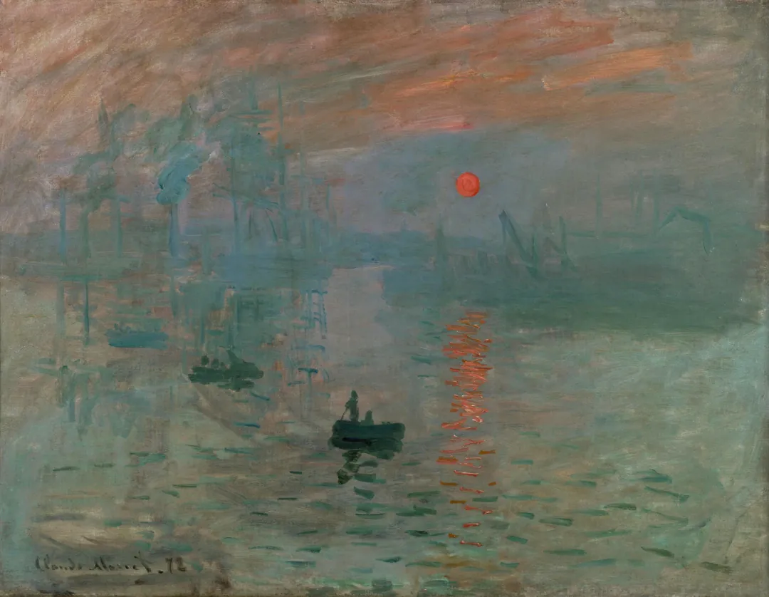
В работе Клода Моне «Пейзаж с рекой» оттенки синего и зеленого мягко смешиваются. Здесь нет визуальных толчков. Результат — глубокое спокойствие, окутывающее зрителя. Гармония служит для того, чтобы сказать зрителю: оставайся здесь, всё под контролем.
Трение, которое зажигает взгляд
Иногда художник не хочет, чтобы вы отдыхали, — он хочет вас разбудить. Здесь в игру вступает трение. Трение рождается из контраста, особенно между дополнительными цветами. Дополнительные цвета — это пары, расположенные на противоположных сторонах цветового круга, такие как синий и оранжевый или красный и зеленый.
Рудольф Арнхейм, эксперт в области психологии искусства, говорил, что контраст создает динамическую энергию. Это похоже на искру, которая возникает при сближении двух электрических полюсов.
Вспомните «Полуночников» Эдварда Хоппера. Мы видим интенсивный желтый свет искусственного освещения на фоне глубокой синевы ночи. Это визуальное столкновение создает напряжение и сразу привлекает внимание к конкретной точке. Трение служит для того, чтобы выделить объект и сделать его незабываемым.
Температура меняет пространство
Температура цвета — это способность тонов казаться теплыми или холодными. Это не просто субъективное ощущение, а правило глубины. Теплые цвета, такие как красный и желтый, кажутся приближающимися к зрителю. Холодные цвета — синий и фиолетовый — воспринимаются как удаляющиеся.
Представьте комнату, окрашенную в синий цвет: она покажется вам больше и просторнее. Красная же комната, напротив, будет словно сжиматься вокруг вас. Художники используют этот прием, чтобы создавать пространство без использования геометрической перспективы.
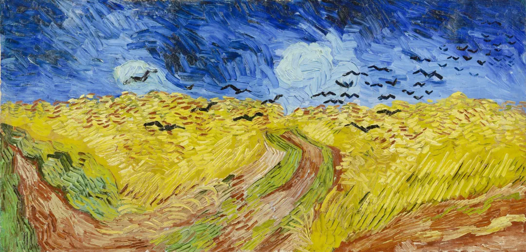
На многих картинах Винсента Ван Гога желтизна пшеницы словно выпрыгивает из холста, в то время как глубокое синее небо создает за ней бесконечную пустоту. Использовать температуру — значит решать, что должно быть на переднем плане, а что — служить фоном.
Почему цвета кажутся разными
Частый вопрос: почему один и тот же красный кажется разным, если поместить его рядом с зеленым или серым? Ответ кроется в одновременном контрасте. Наш глаз никогда не видит цвет сам по себе — он всегда сравнивает его с окружением.
Если поместить серый квадрат на красный фон, серый будет казаться слегка зеленоватым. Это происходит потому, что глаз пытается сбалансировать красный, самостоятельно «достраивая» его дополнительный цвет. Это не ошибка зрения, а естественный механизм поиска равновесия. Художники знают об этом и используют фоновые цвета, чтобы заставить главные объекты сиять или, наоборот, приглушить их.
Что взять с собой
Умение видеть цвет — это навык, который можно натренировать. С сегодняшнего дня, когда вы рассматриваете произведение искусства, попробуйте задать себе три вопроса:
- Цвета близки друг к другу (гармония) или сталкиваются (трение)?
- Какие части картины выступают вперед благодаря теплоте тона?
- Какую эмоцию передает доминирующая температура?
Когда меняется фокус внимания, меняется и восприятие. Цвет перестает быть просто пятном и становится точным языком.
Практикуйтесь прямо сейчас
Вы изучили метод. Теперь примените его на практике.
Упомянутые произведения
Примените на практике
Вы прочитали метод. Теперь потренируйте взгляд на реальных примерах.
Попробовать квиз ArtwithWhy